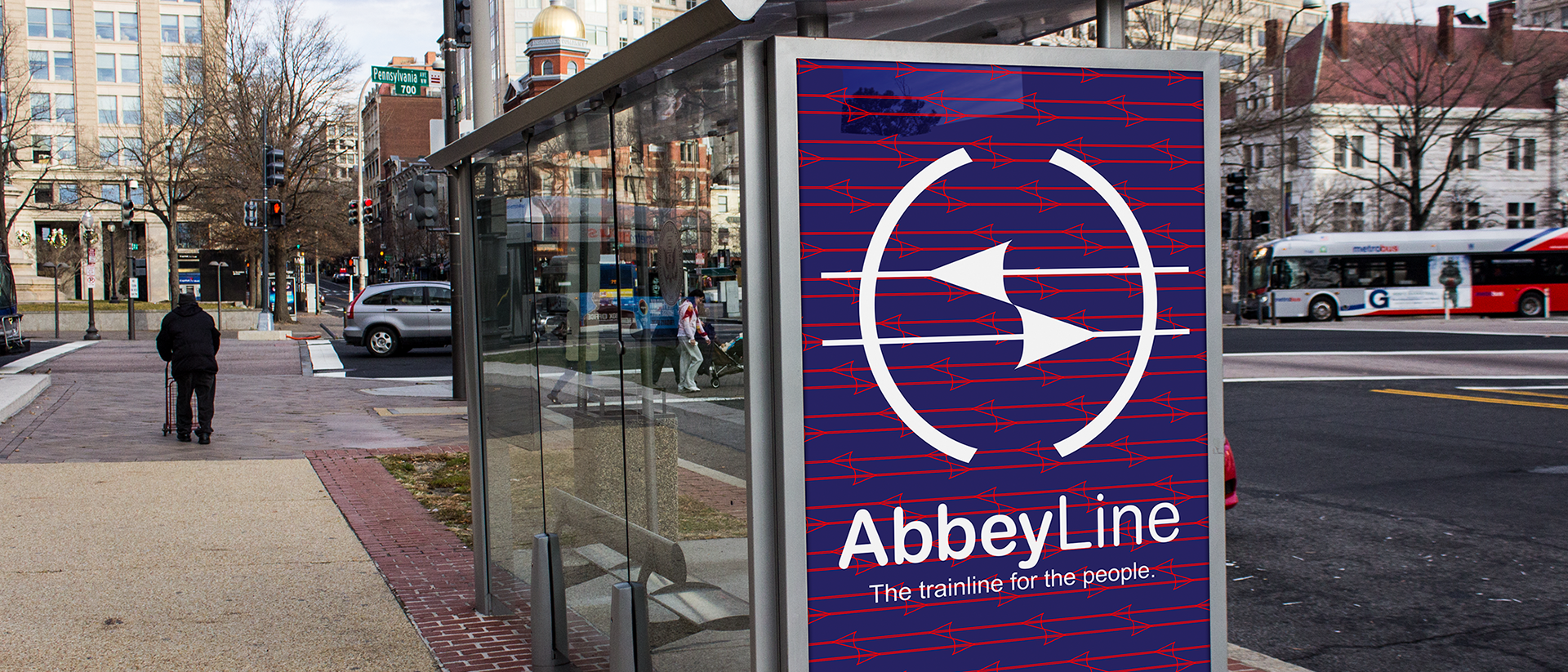
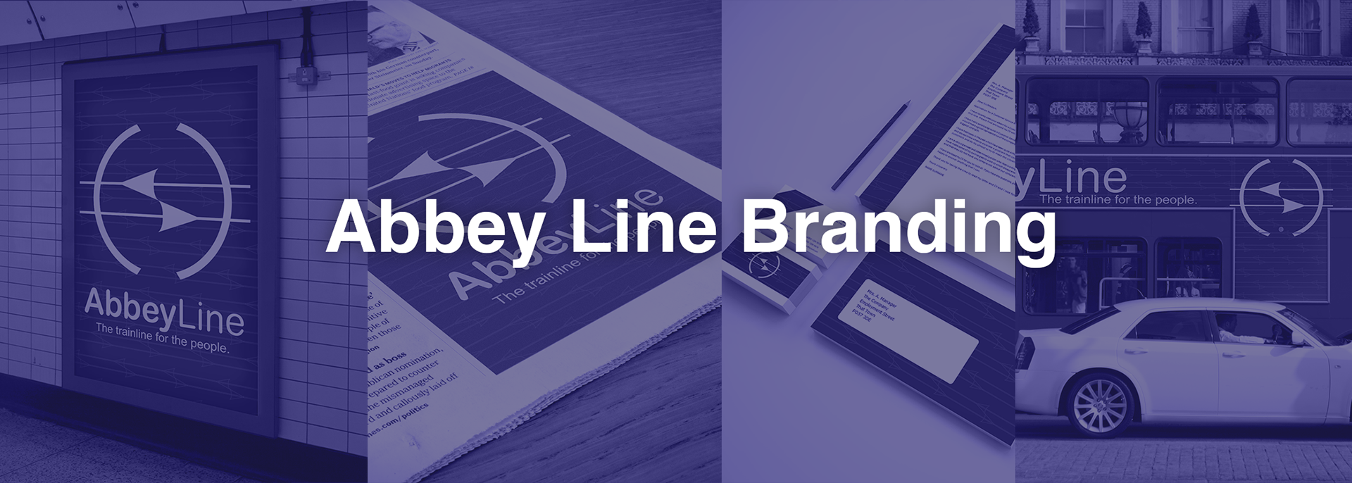
The Abbey Line is a train line that runs from St Albans to Watford. The brief I was given expressed that the abbey line needed exposure, what better way for exposure than a rebrand of the brand?

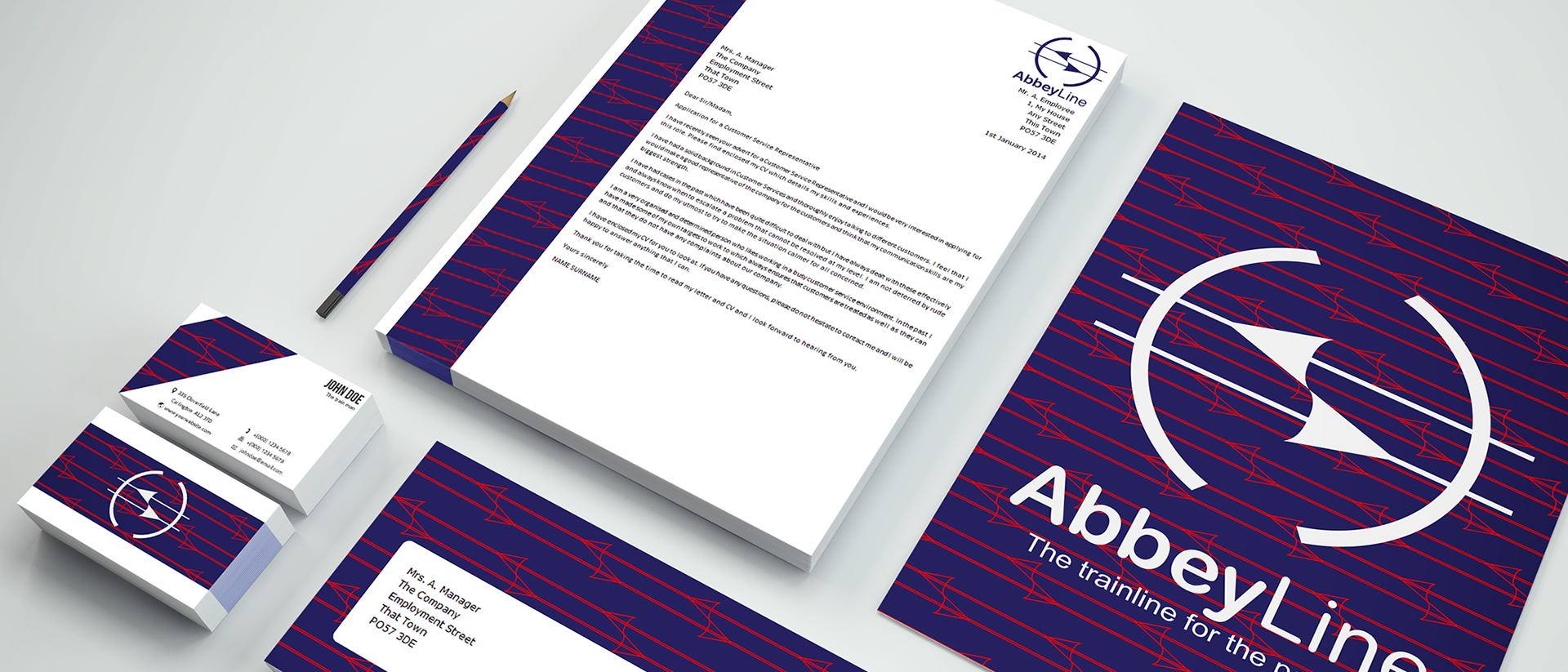
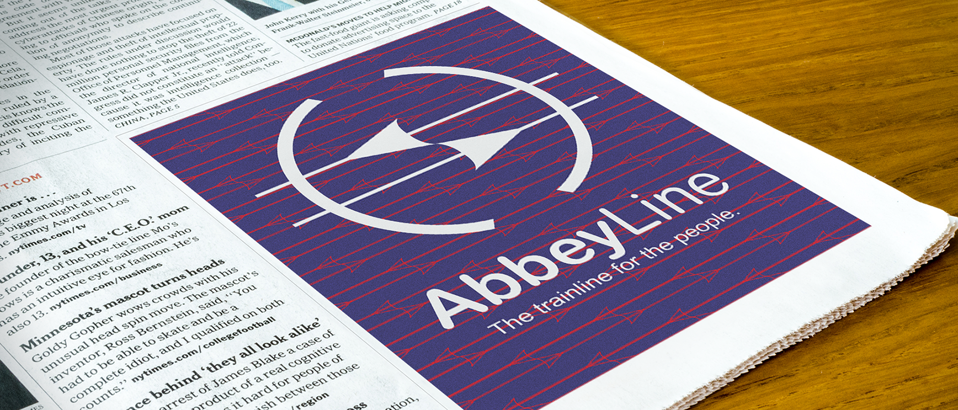
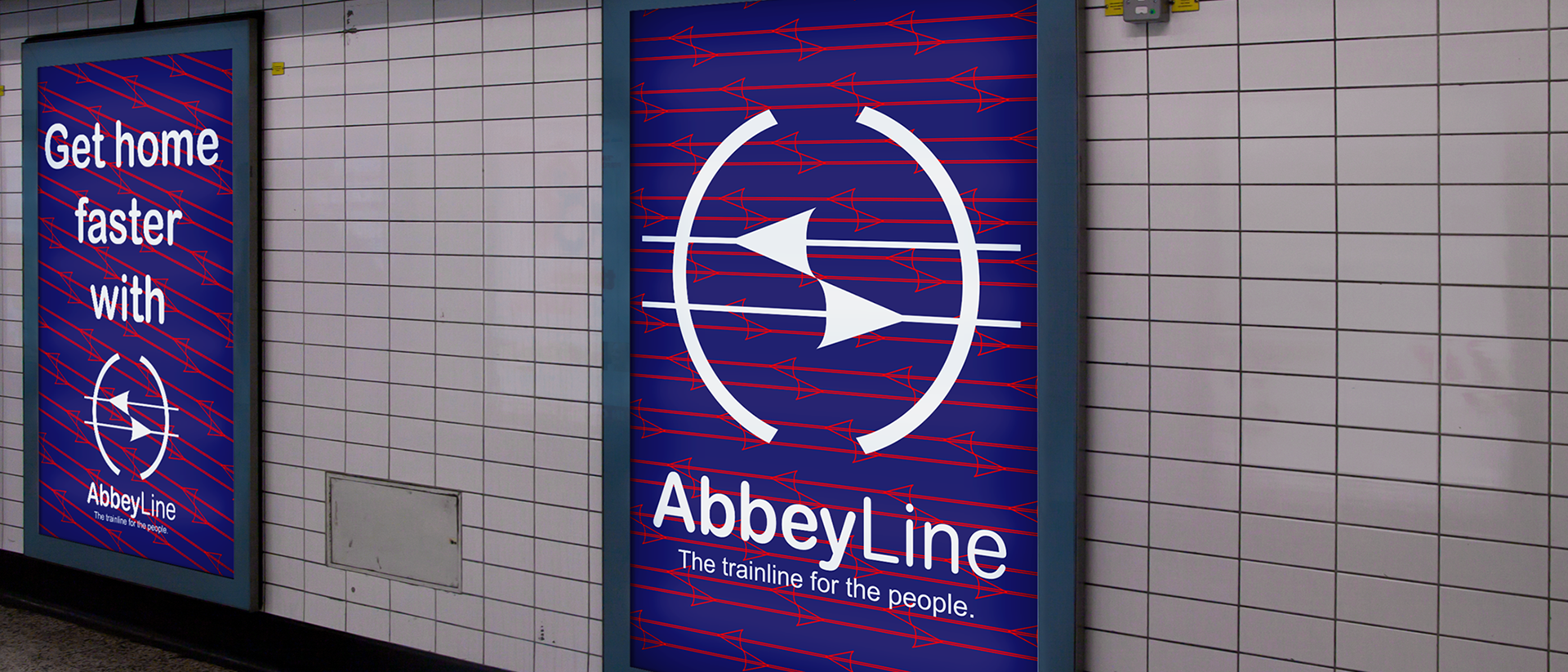
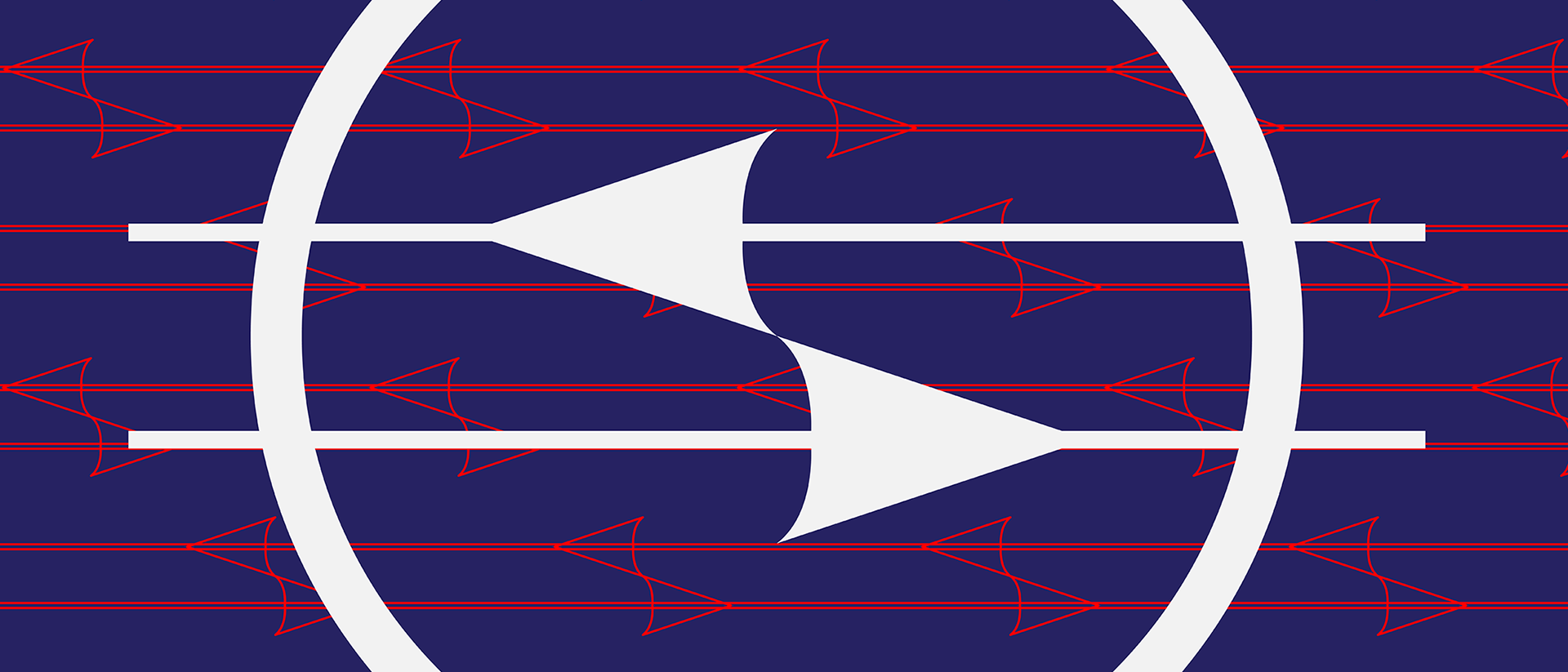
The Logo implements the design of a rail line throughout it. The most obvious one are the parallel lines, these represent the tracks. The opposite facing arrows connect in the centre and represent the trains on a track. The final shape is the brackets on each side, I've taken that design choice from the parts I found on the train this includes, buttons, shapes on the floor and the design found on the seats.


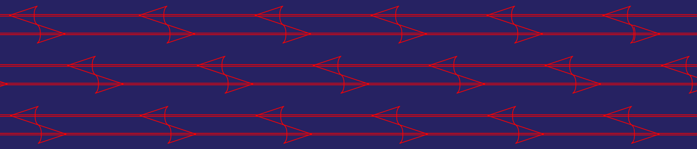
The main basis for the design had a pattern that could be used across a range of media. What I came to use was the centre design from the logo. This was able to be duplicated so that a pattern formed. For colours I went with a darker blue with a contrasting red, this helps the design pop and bring attention to it.

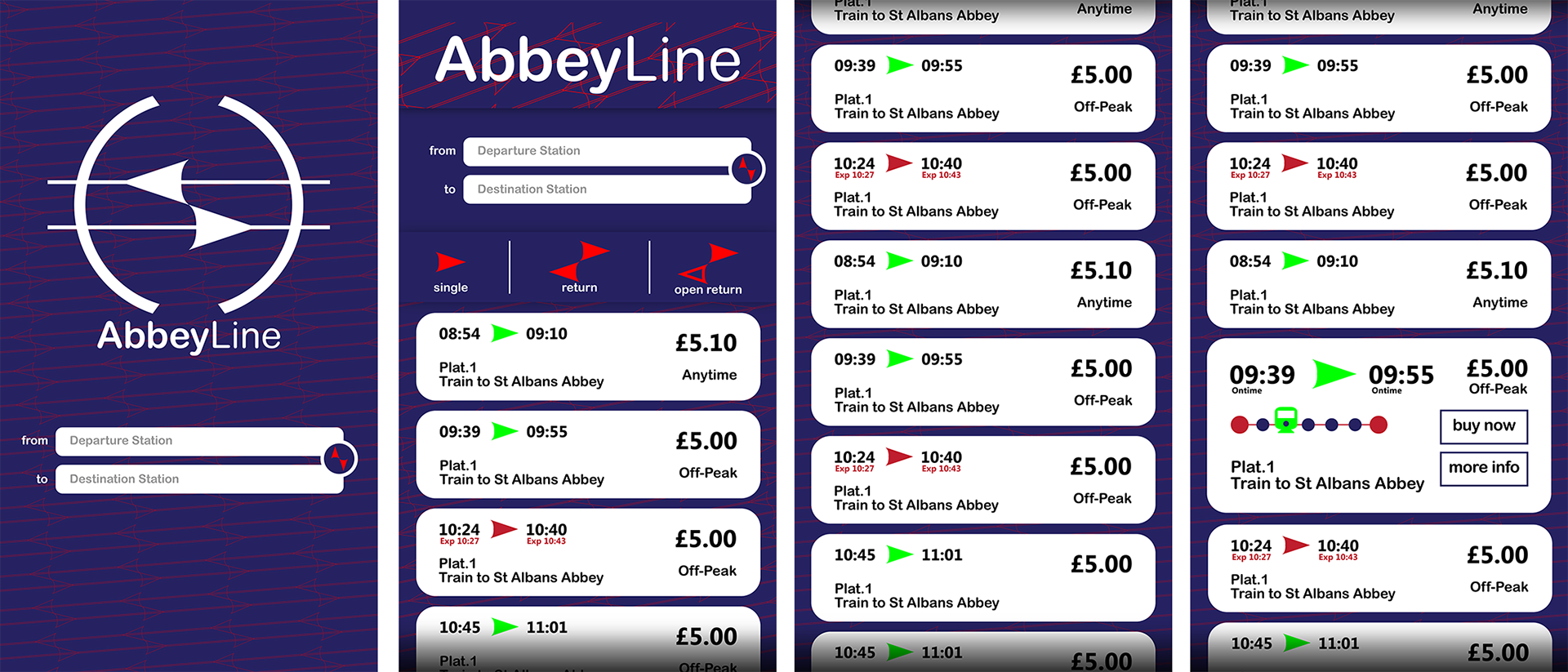
Here are some mockup designs created in photoshop. These do not represent the final product just an idea of how the brand will look.